


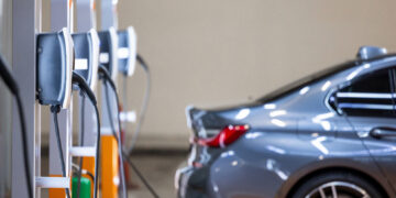
Touchscreens look modern, but they often complicate basic driving tasks. Many systems bury simple controls under layers of menus. Adjusting temperature or changing radio stations can demand more attention than expected. That split second of distraction matters on busy roads. Drivers end up glancing away longer than they should. Physical buttons once handled these tasks with ease. Now, many cars trade convenience for a clean dashboard look. Owners often complain about lag, confusing layouts, and hidden controls. This list focuses on models where touchscreen use feels risky during daily driving. Here are 23 cars with touchscreens that make simple tasks dangerous.
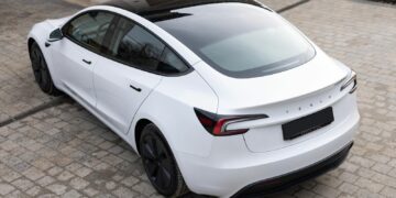
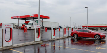
Tesla Model 3
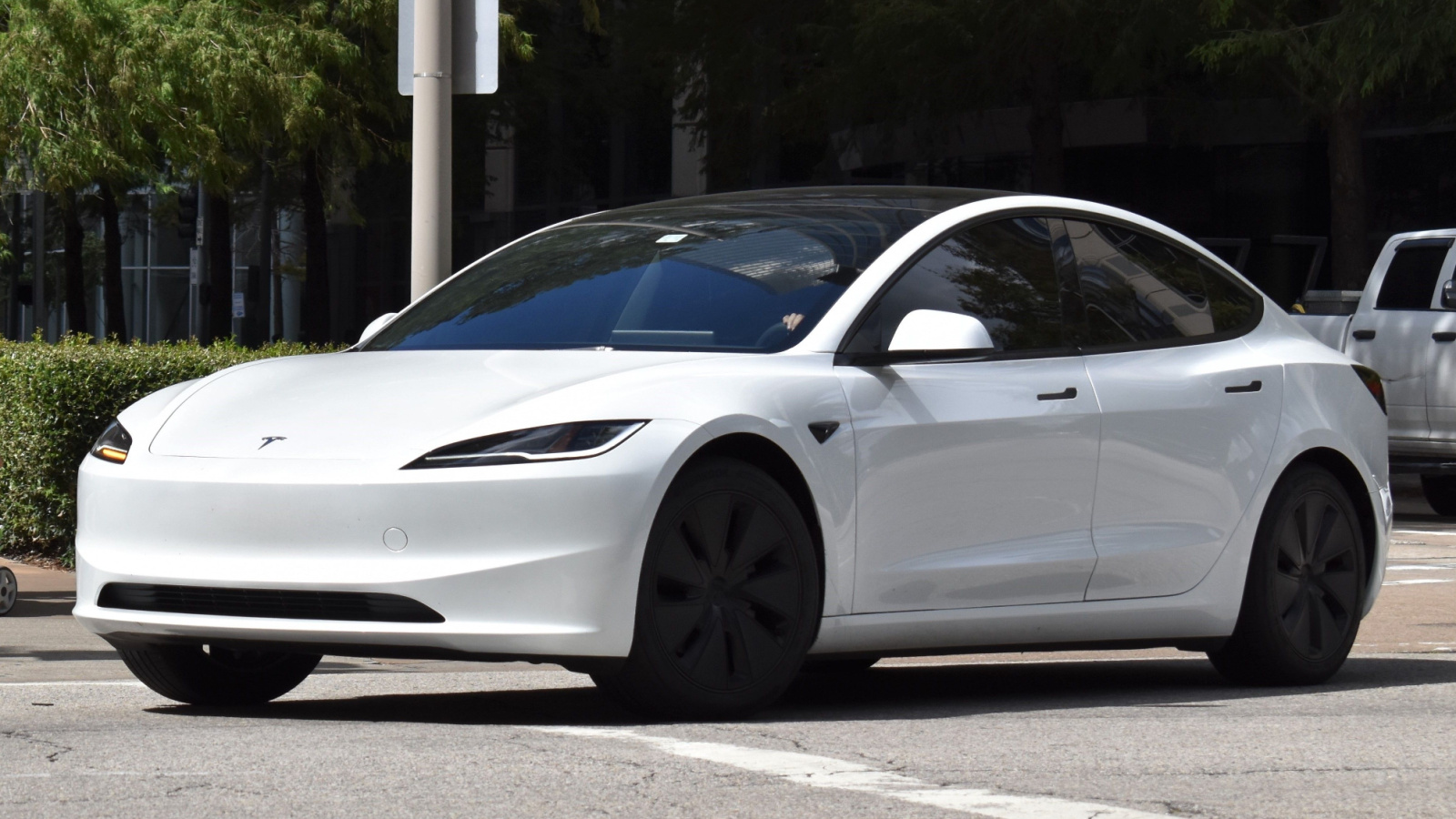
The Tesla Model 3 relies almost entirely on its central screen. Even basic functions sit inside menus. Adjusting mirrors or opening the glovebox requires screen interaction. Drivers must look away often, which increases distraction. There are a few physical controls to fall back on. The interface looks simple but hides many steps. New users struggle during the first weeks. Even experienced owners admit it demands attention. Voice commands help, but are not always reliable. The system can lag during updates. For daily driving, the lack of tactile controls creates real inconvenience and risk.
Tesla Model S
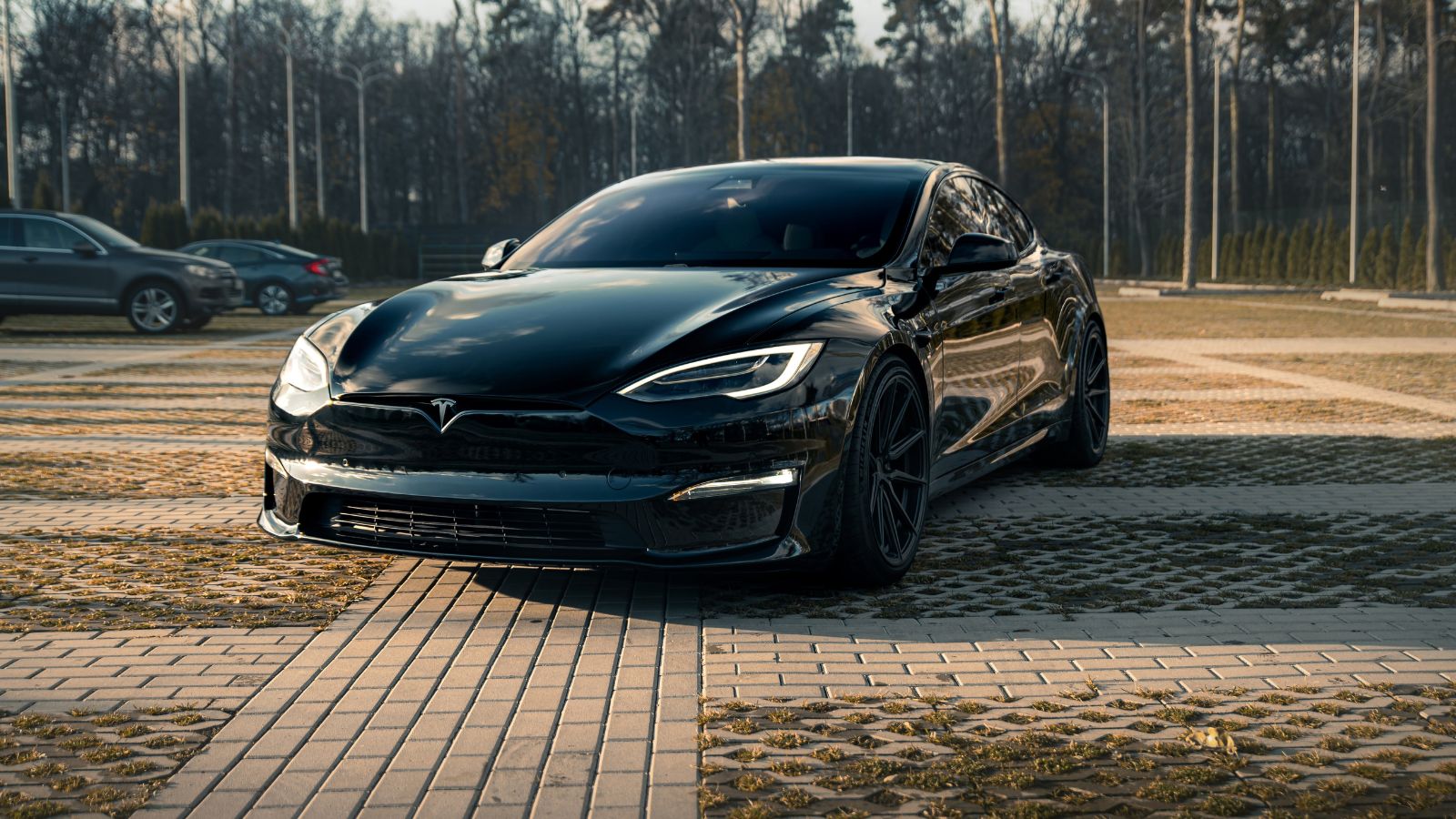
The Tesla Model S pushes screen use even further. The large display controls nearly everything inside. Climate adjustments, seat settings, and navigation all sit in one place. The steering yoke adds to the challenge for some drivers. Simple actions require multiple taps. The screen layout changes after software updates. That forces drivers to relearn basic tasks. Glare can also affect visibility during sunny drives. Physical feedback is missing, so users rely on visual confirmation. This increases the time spent looking away from the road. The experience feels futuristic, but it can reduce focus while driving.
Volkswagen Golf Mk8
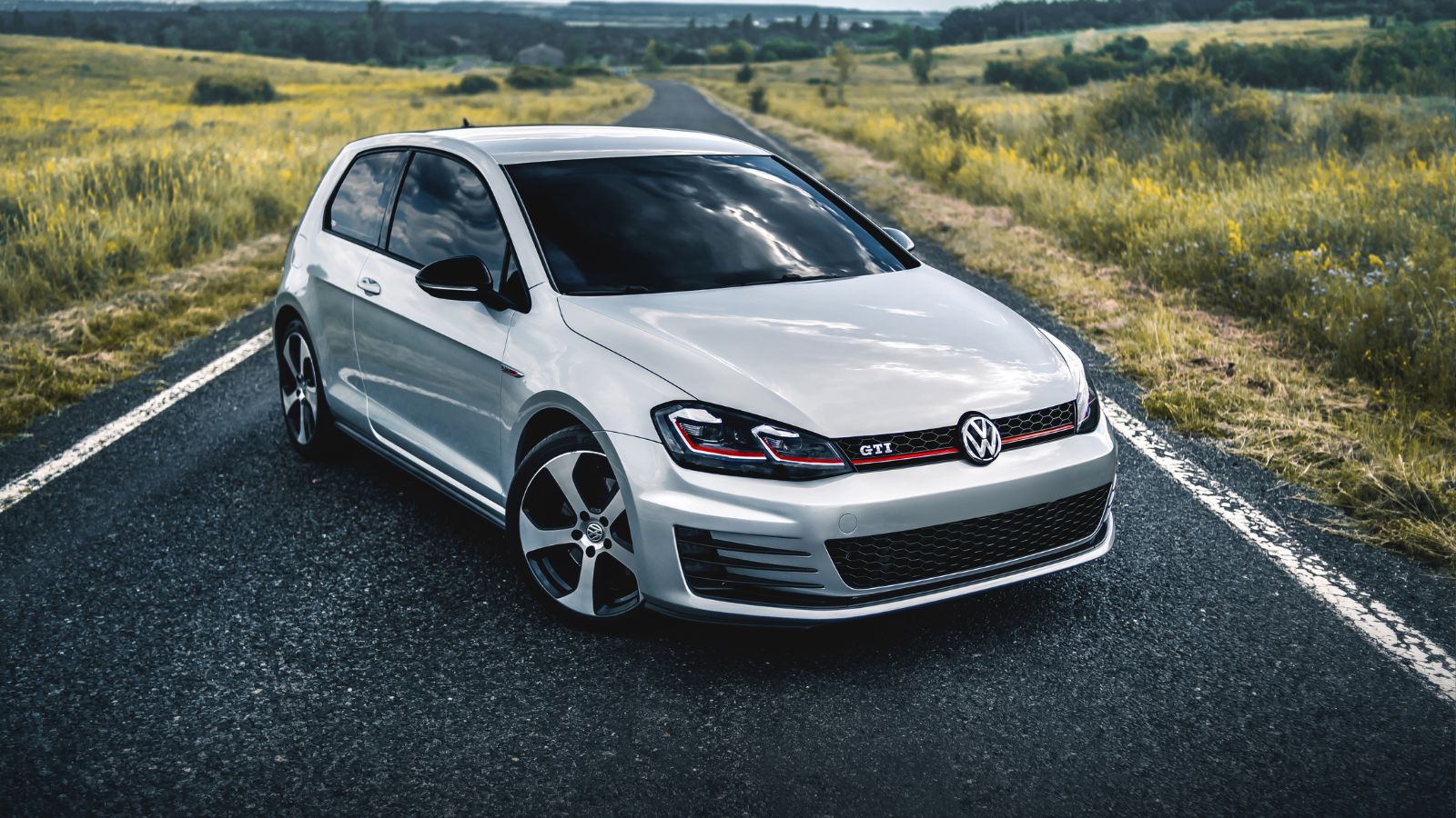
The Volkswagen Golf Mk8 replaced many buttons with touch-sensitive controls. Even climate sliders lack proper lighting at night. Drivers struggle to adjust the temperature quickly. The infotainment system can feel slow during use. Menu layouts are not always intuitive. Volume and temperature controls require careful attention. Accidental inputs are common due to touch sensitivity. The system demands more focus than older models. Owners often mention frustration during daily commutes. Physical knobs would solve many issues here. Instead, the design prioritizes minimalism over usability. That trade-off becomes obvious during real-world driving.
Volkswagen ID.4
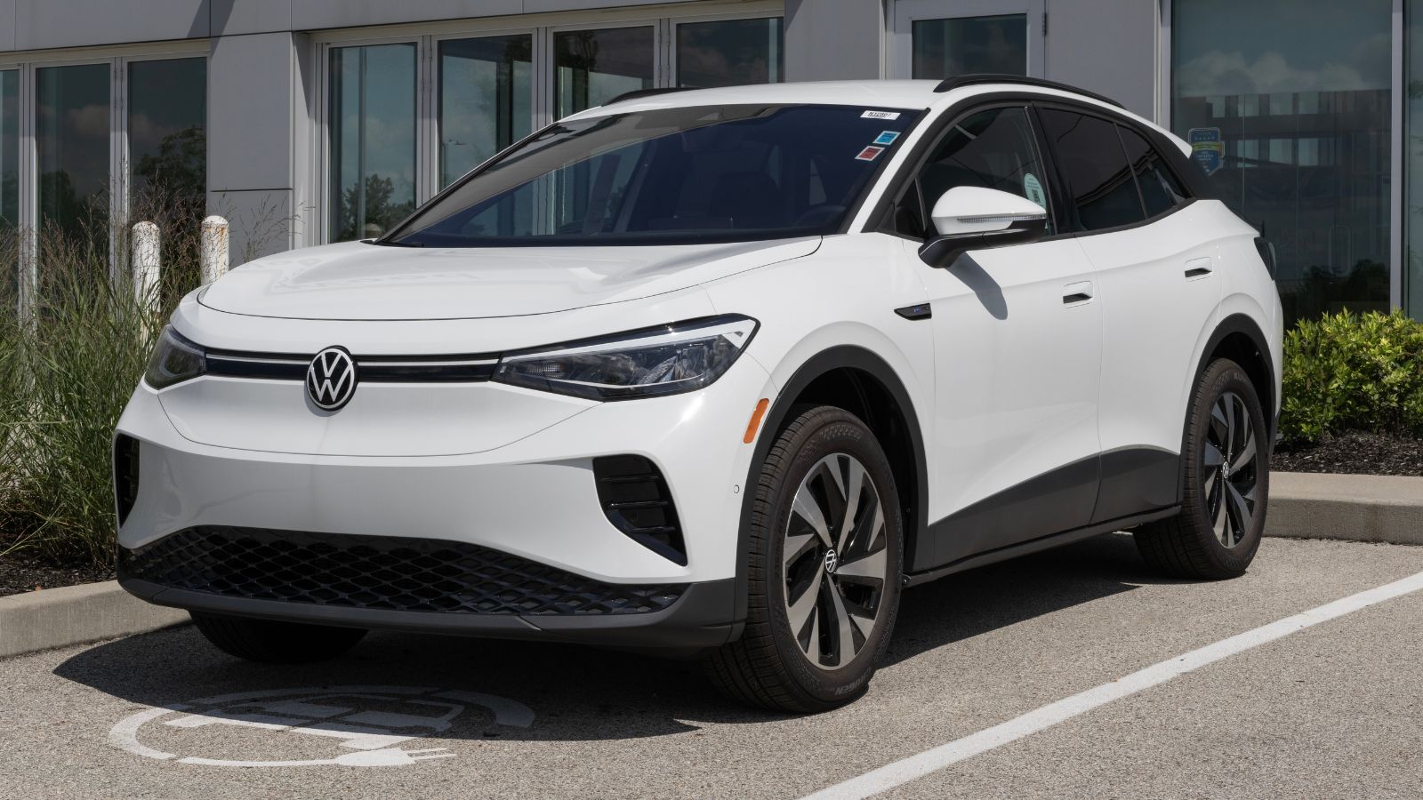
The Volkswagen ID.4 continues the same approach as the Golf. Touch sliders and screen controls dominate the cabin. Climate adjustments require precise input on a flat surface. Drivers cannot rely on muscle memory. The infotainment system sometimes lags under load. That delay adds frustration when making quick changes. Important controls feel hidden inside menus. Night use becomes harder due to poor illumination. Many users report needing extra time to learn the system. Even then, it never feels natural. The design looks clean, but it reduces ease of use in everyday situations.
Volvo XC60
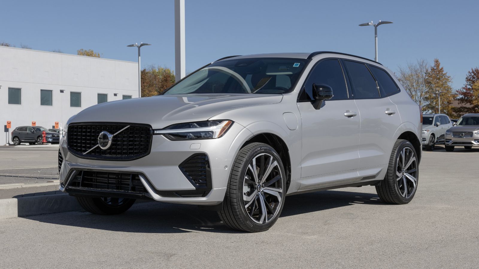
The Volvo XC60 uses a portrait touchscreen for most controls. Climate functions sit within the display instead of physical buttons. Adjusting airflow or temperature takes multiple steps. The system responds well, but still requires attention. Drivers must scroll through menus while driving. Fingerprints and glare affect visibility. The layout feels organized but not quick to use. Heated seat controls also sit inside the screen. That slows down simple actions during cold weather. Volvo aims for a modern feel, but practicality takes a hit in daily use.
Volvo XC90
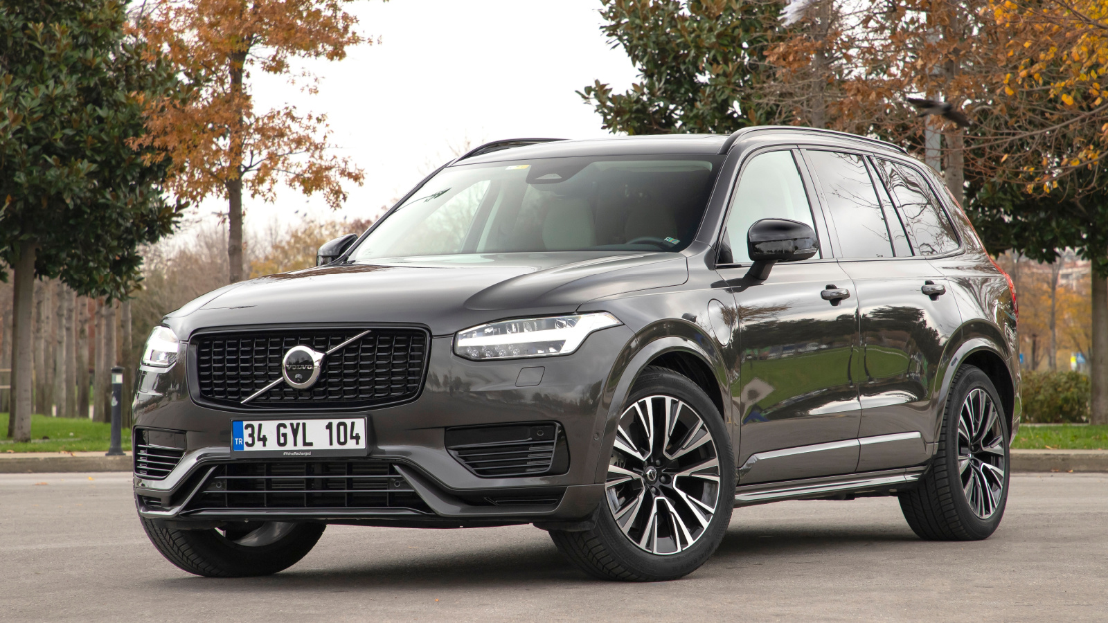
The Volvo XC90 shares a similar interface with the XC60. The large screen controls most cabin features. Drivers depend heavily on the display while driving. Climate adjustments are not immediate. Navigating menus requires visual focus. The system looks premium but lacks quick access buttons. Passengers may struggle to help without guidance. Screen glare becomes noticeable in bright light. Finger smudges build up quickly during regular use. While the car feels refined, the touchscreen adds complexity. Basic tasks take longer than expected behind the wheel.
Honda Civic (Latest Gen)
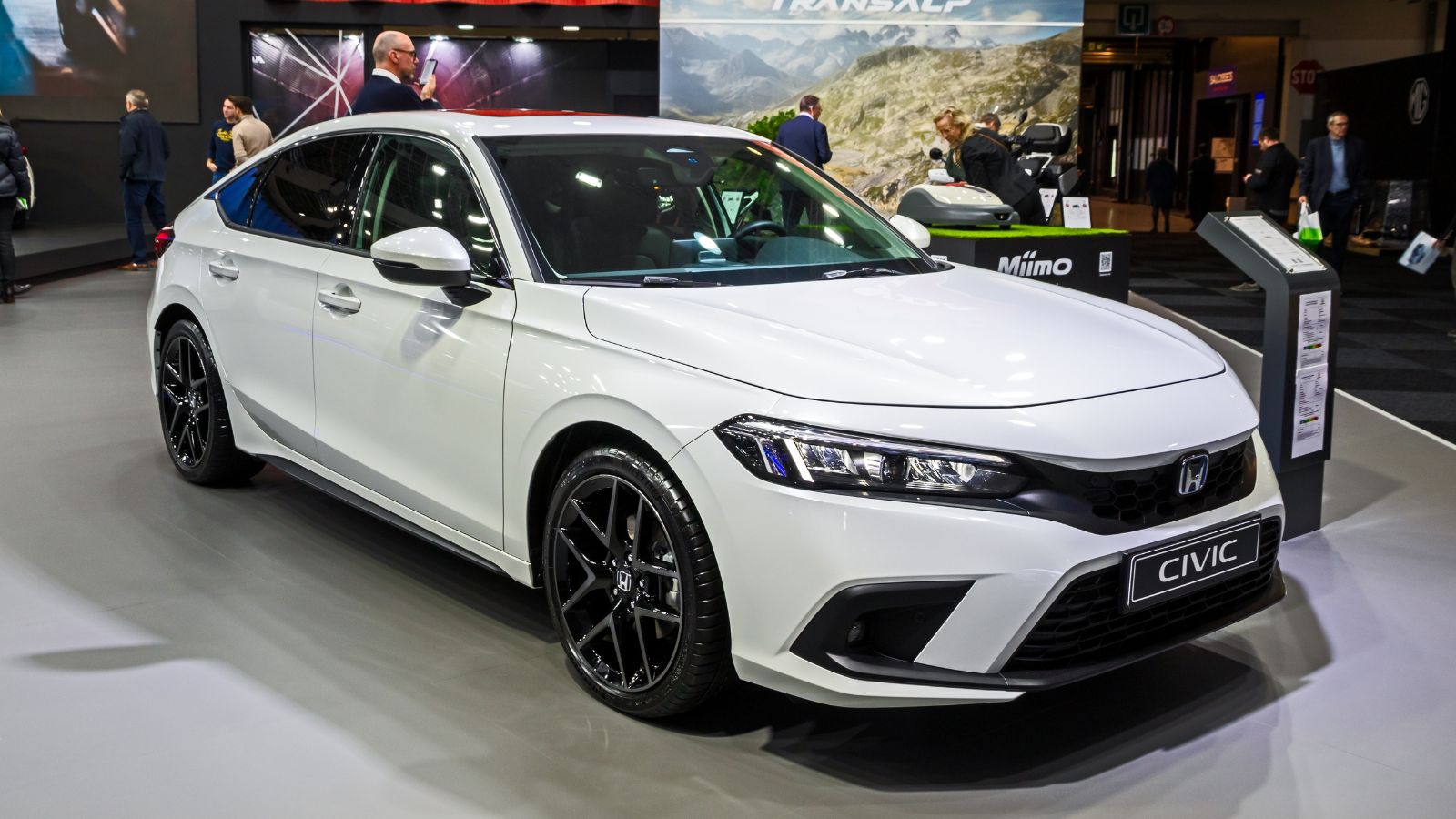
The Honda Civic improved usability compared to earlier versions. Still, some key features rely on the touchscreen. Audio and connectivity functions sit inside menus. Drivers must glance at the screen to confirm actions. The system is smooth but still distracting at times. Physical climate knobs help, but not everything benefits from them. Smartphone integration adds another layer of interaction. Notifications can pull attention away. The layout works, but it demands familiarity. New users often take time to adapt. Even then, it is not always the quickest system to operate.
Mazda CX-50
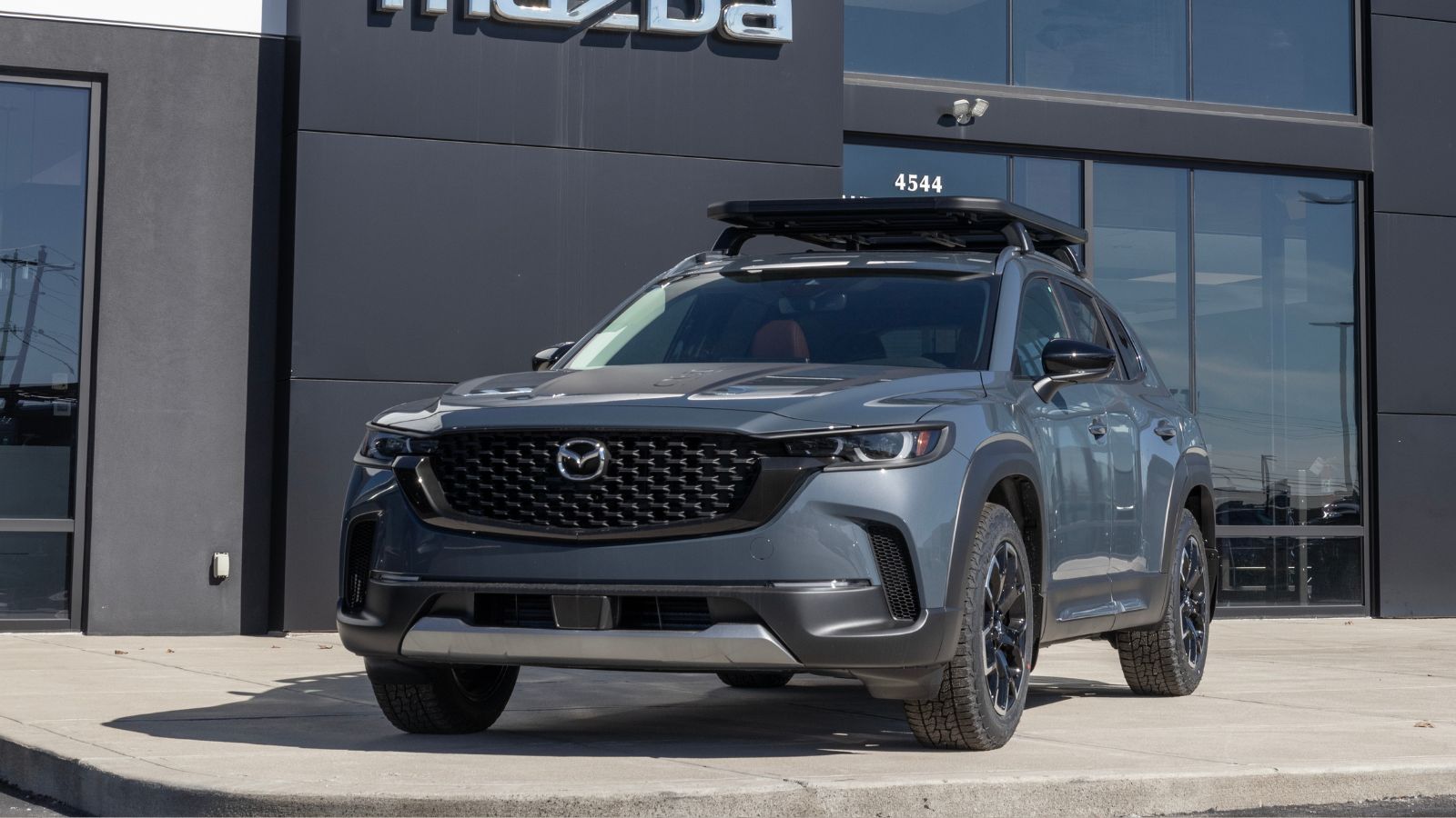
The Mazda CX-50 uses a screen controlled by a rotary dial. That reduces direct touchscreen use while driving. However, some functions still require menu navigation. The interface can feel complex for new users. Simple changes may take several steps. The dial helps, but adds its own learning curve. Drivers must look at the screen often. The system blocks touch input while moving. That limits quick adjustments. While safer in theory, it still slows down interaction. The setup works best when stationary, not during active driving.
BMW iX
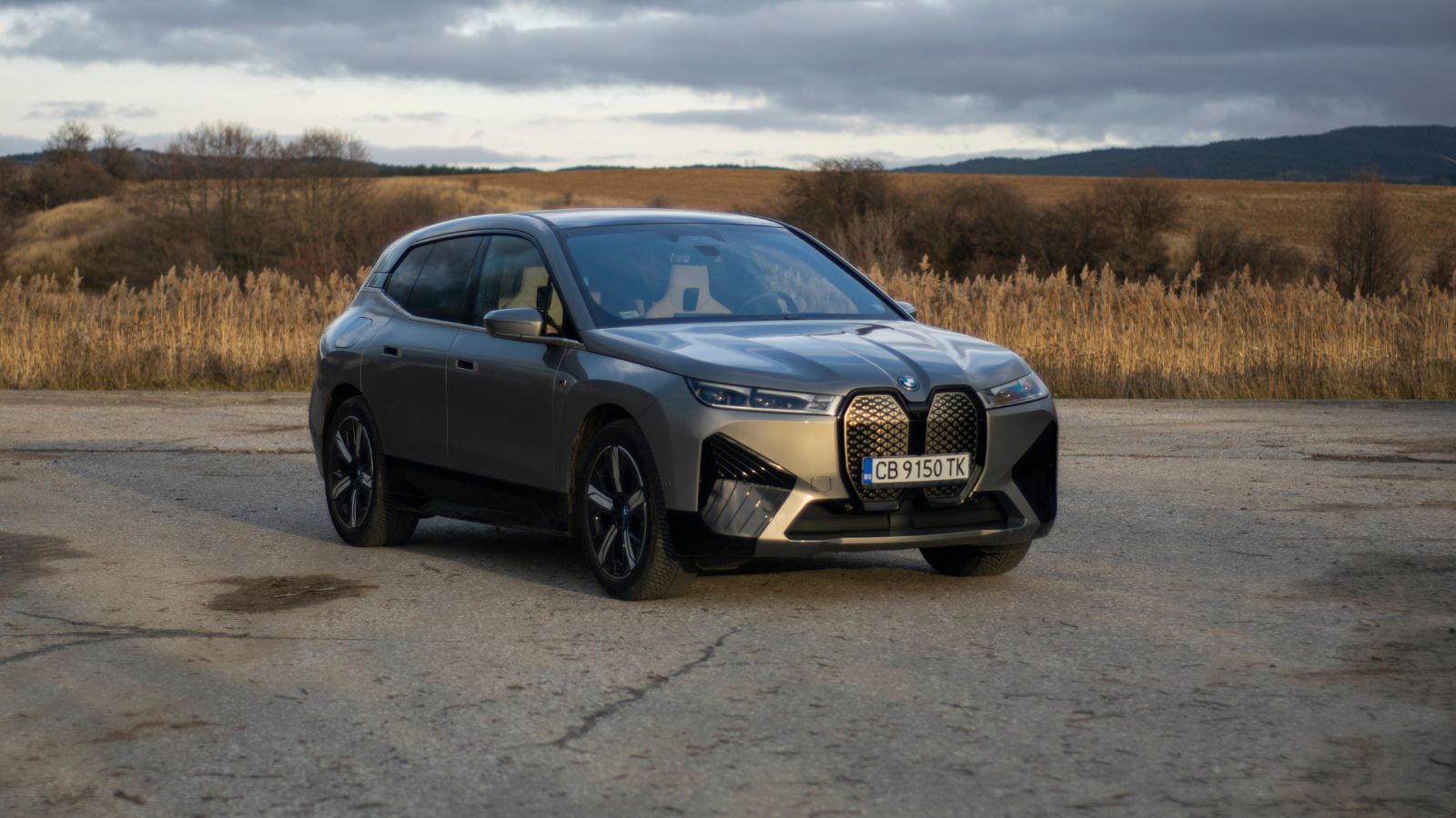
The BMW iX features a curved display across the dashboard. Many controls sit inside this system. Climate, navigation, and settings share one interface. Gesture controls exist, but can misread input. Drivers may trigger unintended actions. Menu depth increases complexity for simple tasks. The system looks advanced, but demands attention. Physical buttons are limited compared to older BMW models. Adjusting settings while driving feels less direct. The experience suits tech-focused users, but not everyone. Daily use highlights the need for quicker, simpler controls.
BMW 7 Series (Latest)
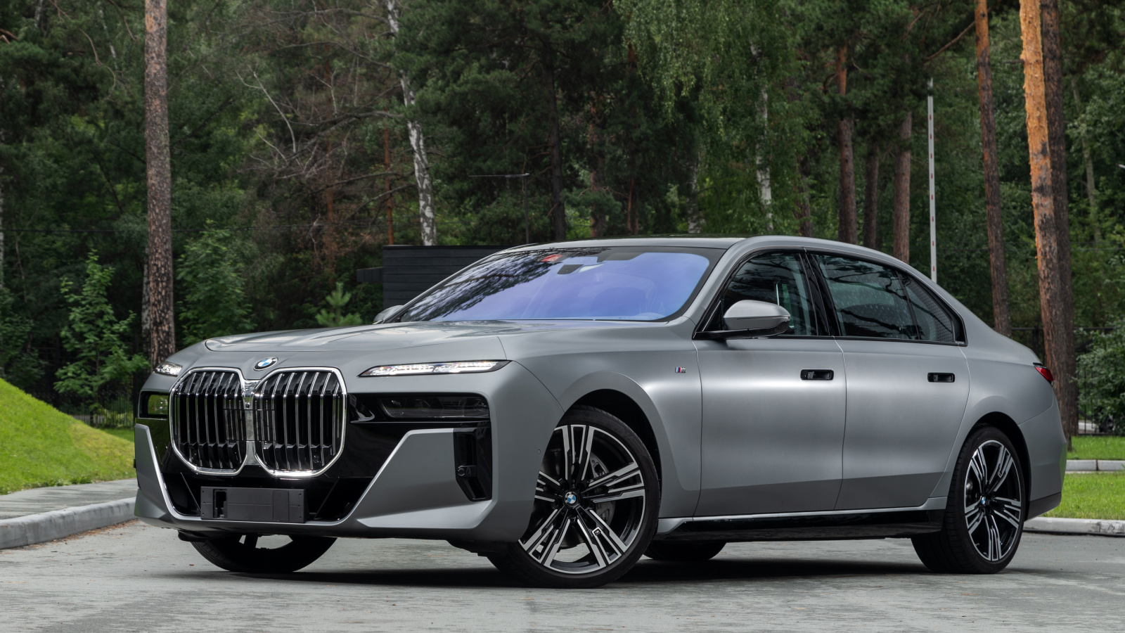
The BMW 7 Series embraces a screen-heavy cabin design. Rear and front controls rely on displays. Climate and seat settings sit inside menus. The system includes many features but lacks simplicity. Drivers must navigate through layers to find options. Touch input requires precision while driving. The iDrive controller helps, but does not solve everything. Visual distraction increases during adjustments. The car feels high-tech but can overwhelm users. Simple tasks take longer than expected. That can reduce focus during busy traffic conditions.
Mercedes-Benz EQS
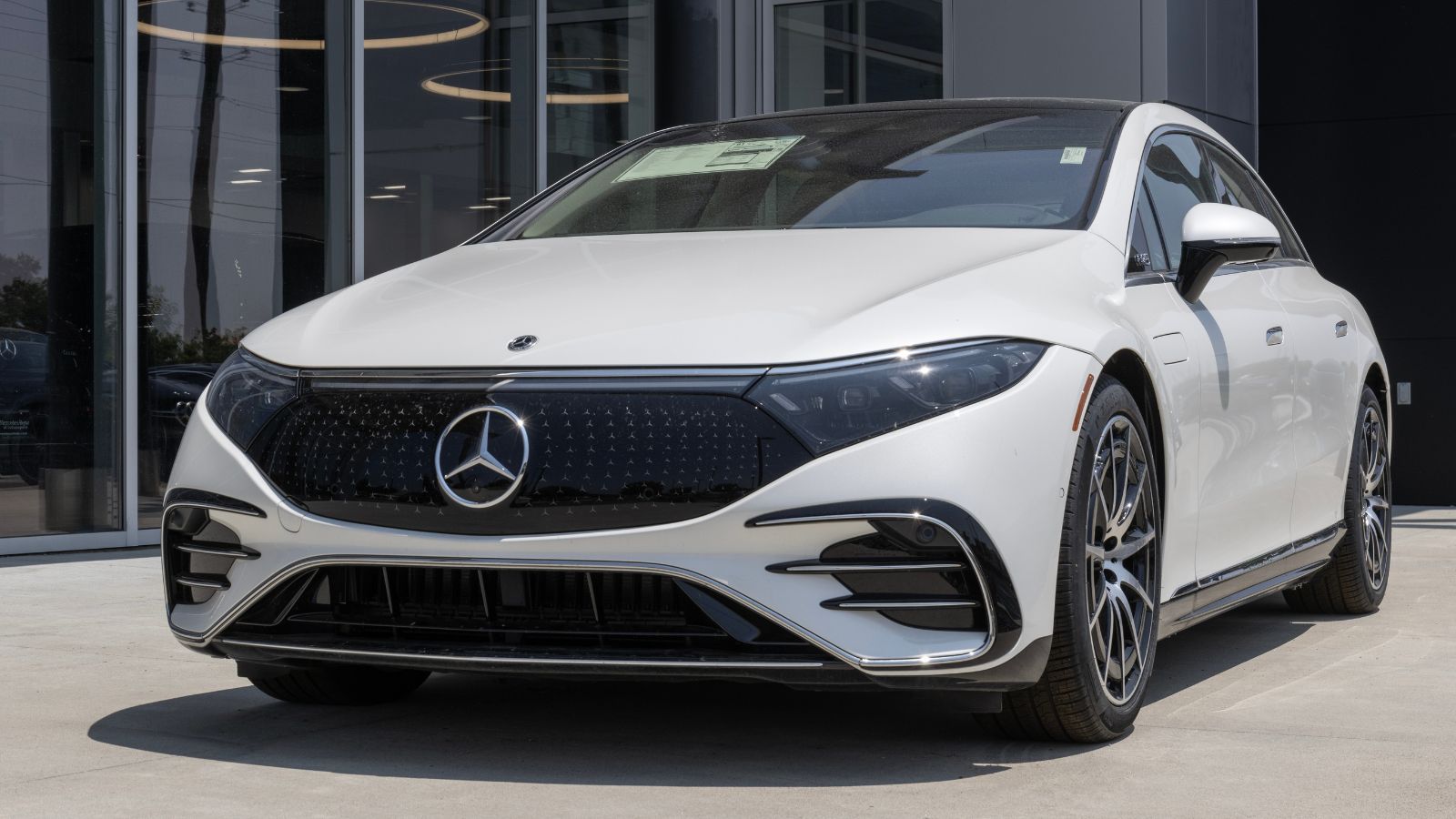
The Mercedes-Benz EQS introduces the massive Hyperscreen setup. It spans almost the entire dashboard. Controls are spread across multiple displays. The interface looks impressive, but it can feel busy. Drivers must scan the screen for options. Climate and media controls share space with other features. That increases cognitive load while driving. The system responds quickly but still demands attention. Fingerprints become visible across the glass surface. While luxurious, it can be overwhelming during daily use. Simpler controls would make tasks easier and safer.
Mercedes-Benz C-Class (New Gen)
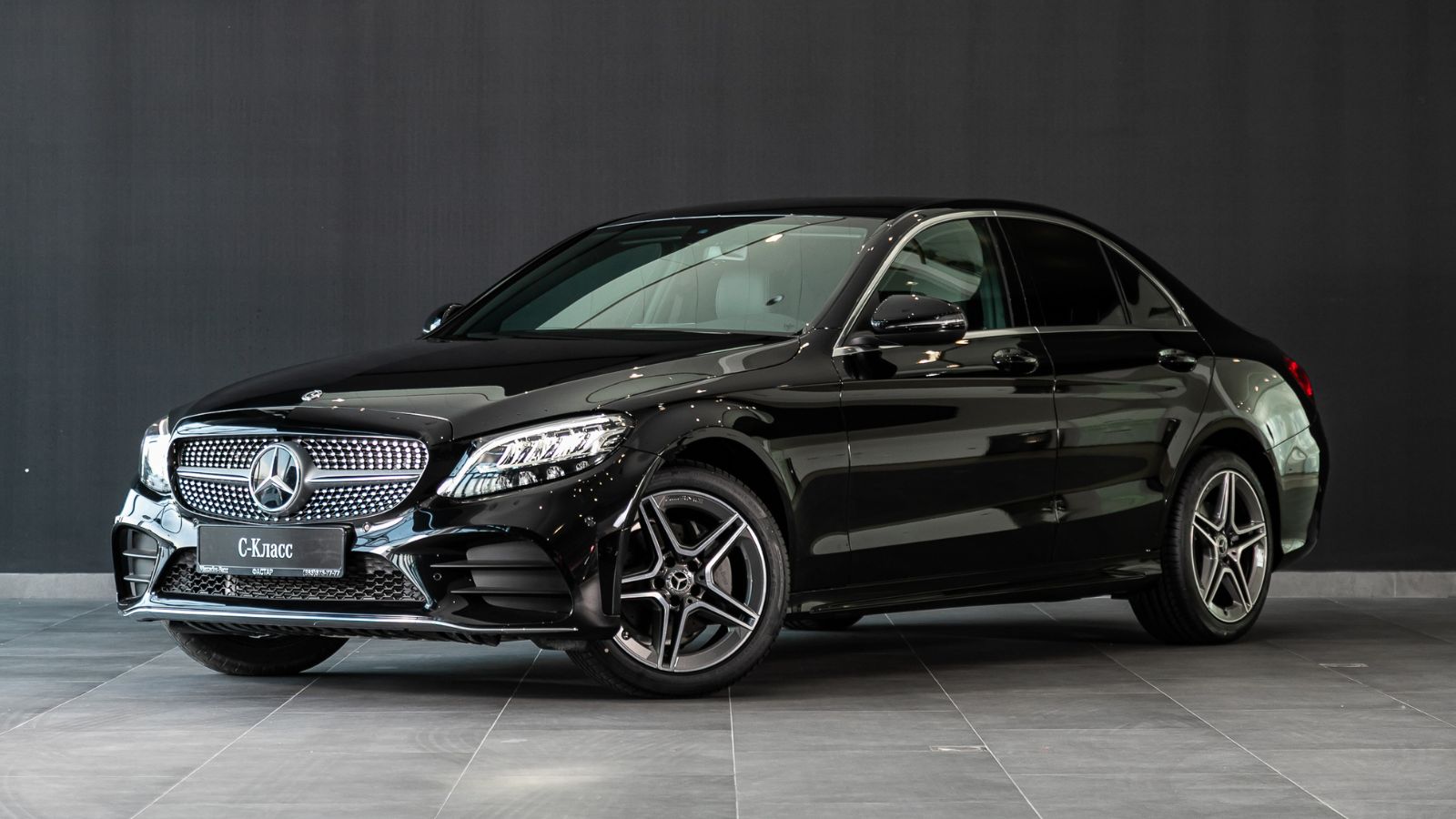
The Mercedes-Benz C-Class replaces many buttons with a large central screen. Climate and vehicle settings sit inside menus. The layout looks clean, but feels less intuitive. Drivers must tap through options to make changes. The system reacts quickly but still needs focus. Steering wheel touch controls add another layer. They can be sensitive during use. Accidental inputs happen more often than expected. The cabin feels modern, but ease of use suffers. Every day driving reveals the downside of reduced physical controls.
Ford Mustang Mach-E
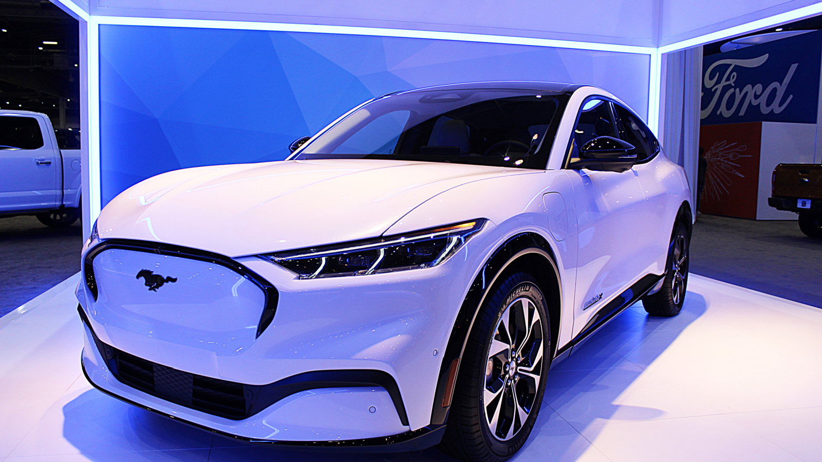
The Ford Mustang Mach-E uses a large vertical touchscreen for most functions. Climate controls sit inside the display. A physical knob exists, but only handles volume. Drivers must rely on the screen for many actions. The interface is smooth but still distracting. Menu navigation takes attention away from the road. Updates can change layout and behavior. That forces users to adapt repeatedly. The system looks simple but hides complexity. Daily driving highlights the trade-off between design and usability.
Ford F-150 Lightning
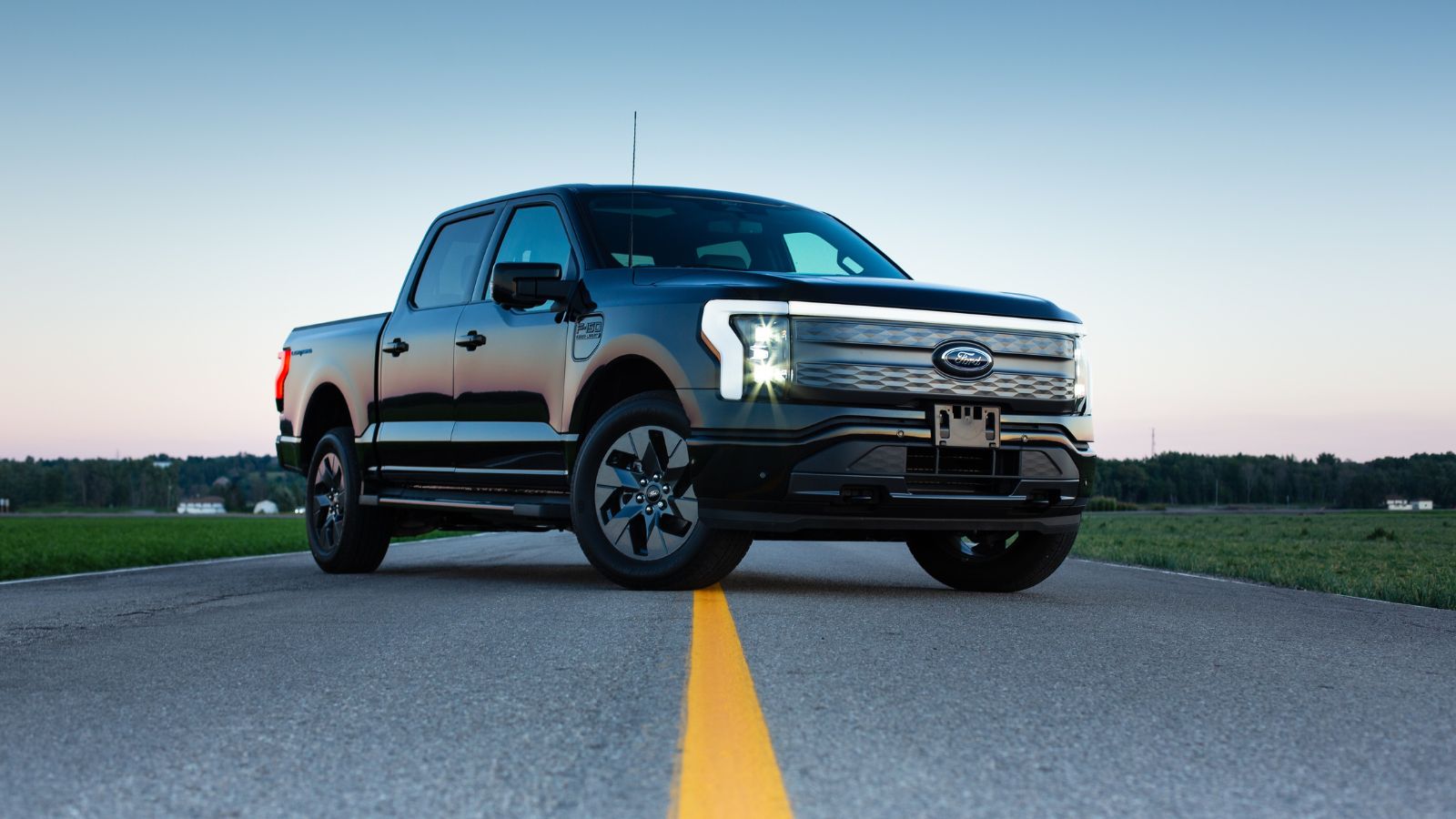
The Ford F-150 Lightning includes a large touchscreen similar to the Mach-E. Many truck functions rely on this display. Climate and towing settings sit inside menus. Drivers must interact with the screen often. The system works well, but still requires focus. Physical controls are fewer than expected in a truck. Adjustments during driving feel less direct. Screen glare can affect visibility outdoors. The design suits tech users but not traditional truck buyers. Every day tasks take more effort than necessary.
Chevrolet Silverado EV
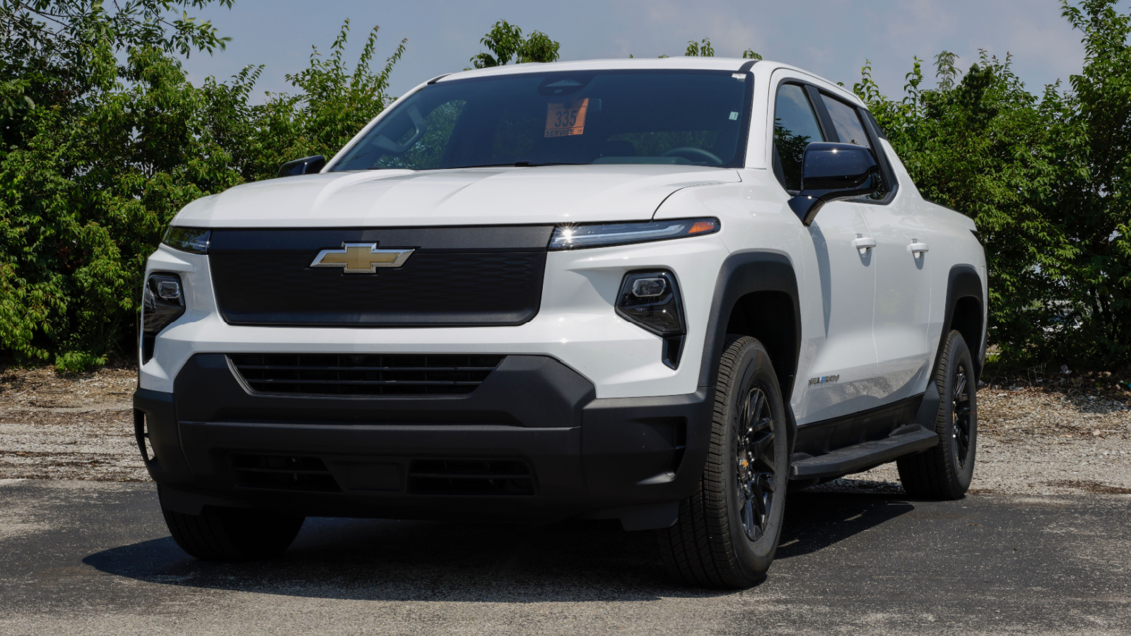
The Chevrolet Silverado EV features a modern screen-based interface. Many functions sit inside the infotainment system. Climate adjustments require screen interaction. Drivers must navigate menus while driving. The system is responsive but still distracting. Physical controls are limited compared to older models. Truck users often prefer tactile inputs. The touchscreen design feels out of place in some situations. Simple tasks take longer than expected. That reduces convenience during daily use. The focus on technology overshadows the ease of operation.
Hyundai Ioniq 5
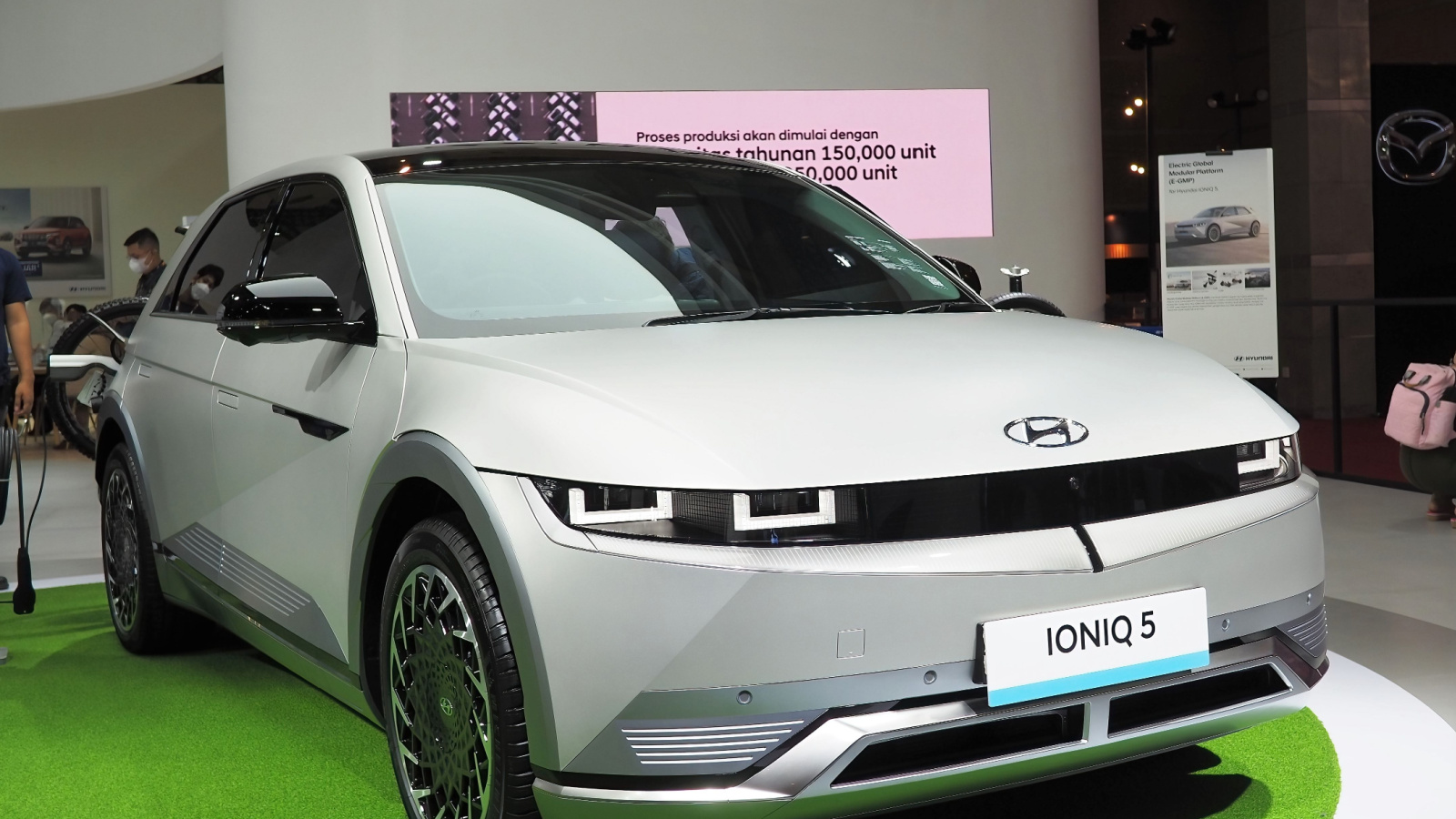
The Hyundai Ioniq 5 blends touch controls with a few physical shortcuts. Still, many functions sit inside the screen. Climate adjustments often require menu navigation. Drivers must glance away longer than expected. The interface looks clean but feels slightly indirect. Sunlight can reduce screen clarity during daytime drives. The system responds well, but interaction still takes effort. While parked, it works smoothly and feels easy. While moving, it demands more focus than ideal. Over time, small delays and extra steps make daily use less convenient than expected for most drivers.
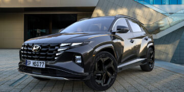
Hyundai Tucson
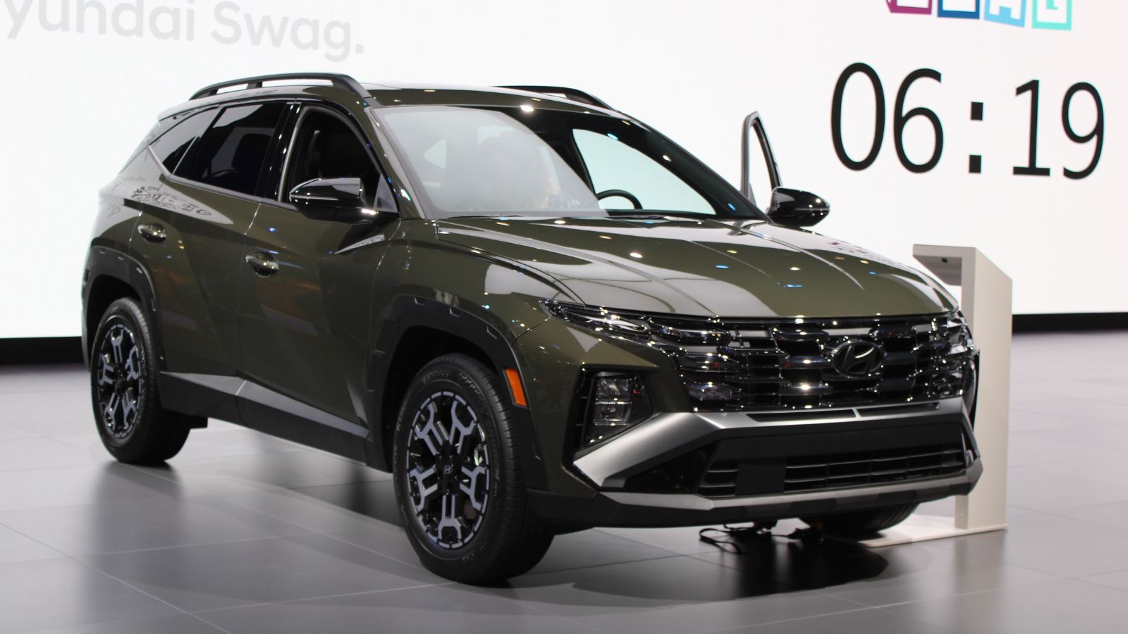
The Hyundai Tucson replaces traditional buttons with glossy touch panels. These surfaces look sharp but feel less practical. Climate controls lack tactile feedback. Drivers must look down to confirm each input. Fingerprints quickly build up, reducing visibility over time. The system responds quickly, but accuracy can vary. Accidental touches happen more often than expected. Night driving adds another challenge due to reflections. Simple adjustments take longer than they should. The setup feels modern but less intuitive. Daily driving highlights how touch panels can complicate routine tasks behind the wheel.
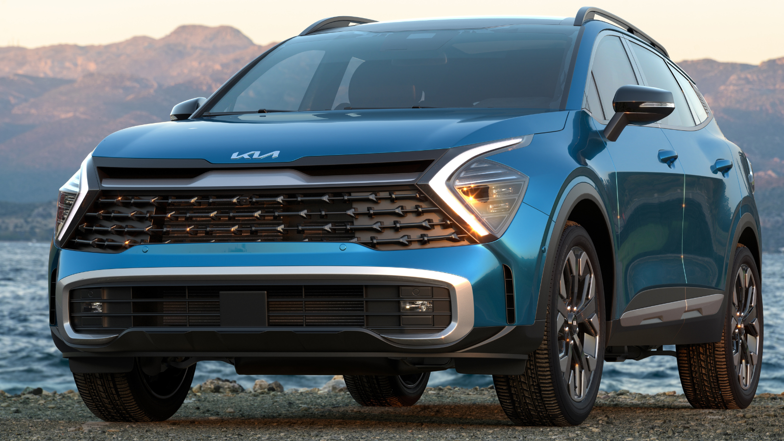
Kia EV6
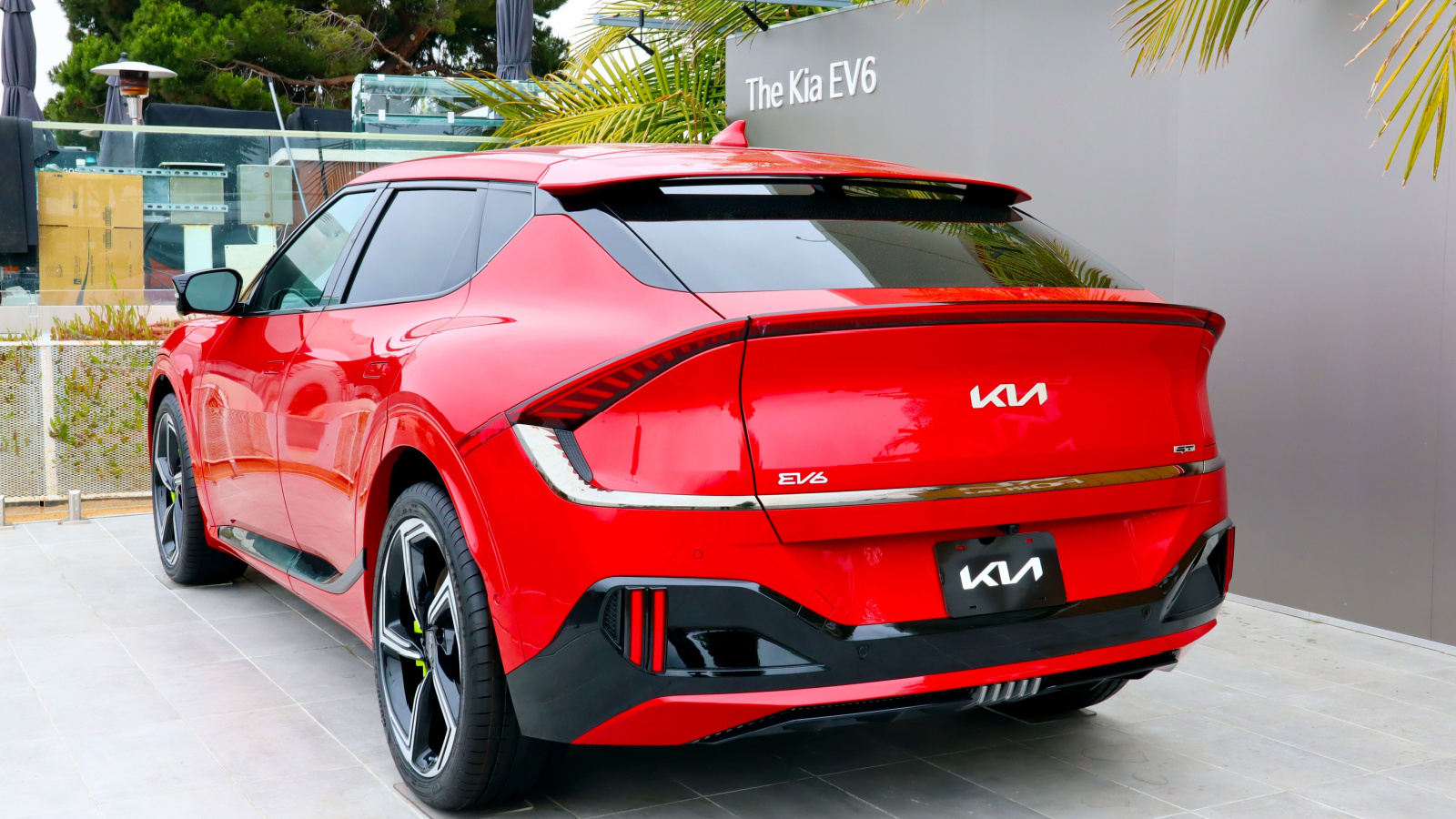
The Kia EV6 uses a dual-purpose touch panel for climate and media. Drivers must switch modes to access different controls. This adds an extra step during use. It looks clever but slows down interaction. Users can forget which mode is active. That leads to wrong inputs while driving. The system feels smooth but still demands attention. Physical buttons would reduce confusion here. The layout favors design over ease of use. Over time, the switching system becomes frustrating. Every day driving reveals how small delays can affect comfort and driver focus.
Kia Sportage
The Kia Sportage follows a similar approach with shared touch controls. Climate and media functions sit on the same panel. Drivers must toggle between them to adjust settings. This adds confusion during quick changes. The interface looks modern but feels less direct. Finger smudges build up quickly on the surface. Drivers often need to double-check inputs. That increases distraction on busy roads. The system works well when stationary. While driving, it demands more attention than expected. Simple actions take longer, which reduces overall ease of use during daily commutes.
Range Rover
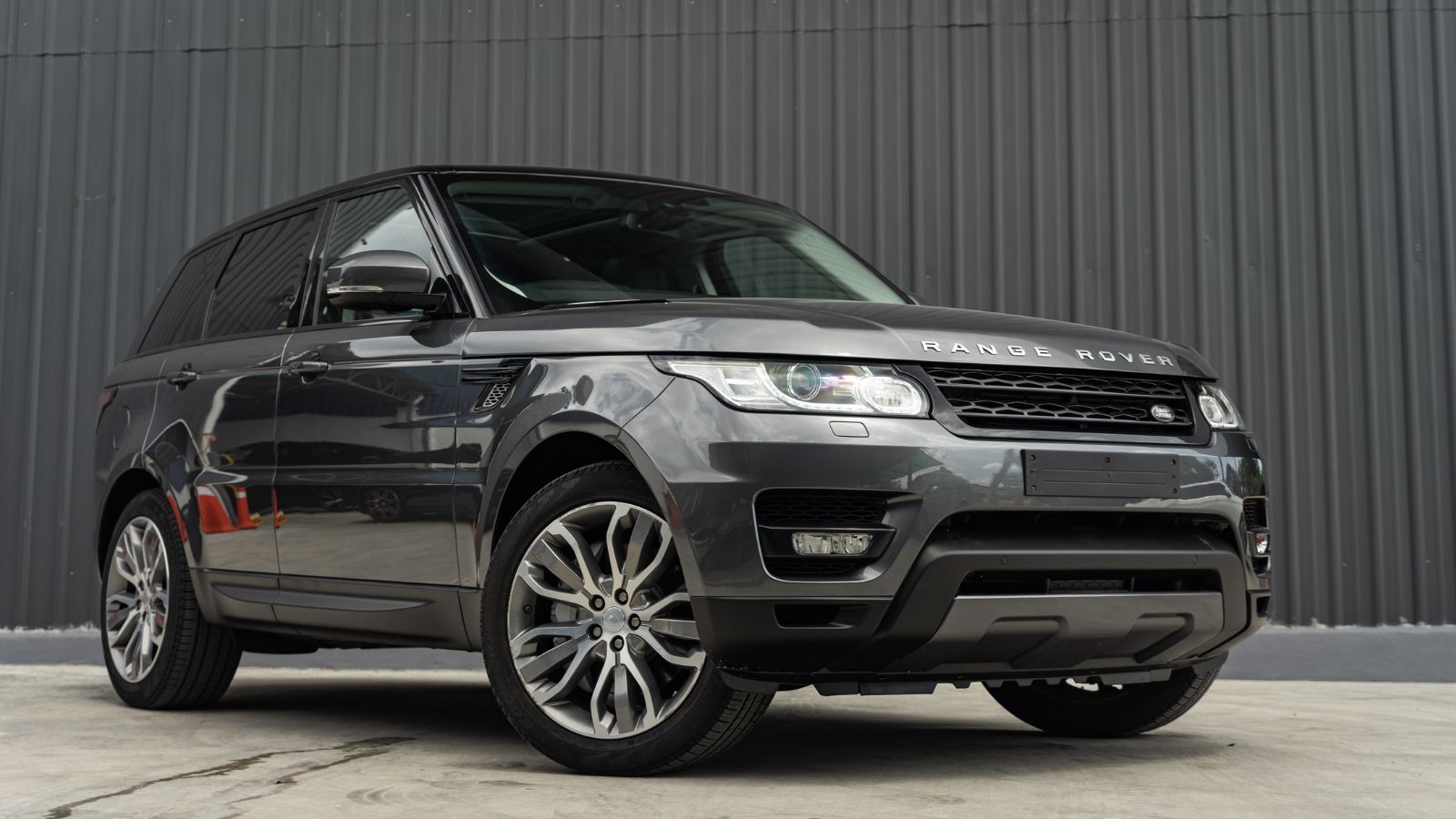
The latest Range Rover removes many physical controls. Most functions now sit inside touchscreen menus. Climate and terrain settings require multiple steps. Drivers must navigate the system while moving. The interface looks refined but feels less immediate. Off-road adjustments can take longer than expected. The system responds well, but still needs focus. Screen glare can affect visibility outdoors. The design favors a clean dashboard look. Practical use feels slower during daily driving. Over time, the lack of quick-access controls becomes noticeable, especially in situations that require fast adjustments.
Audi Q8 e-tron
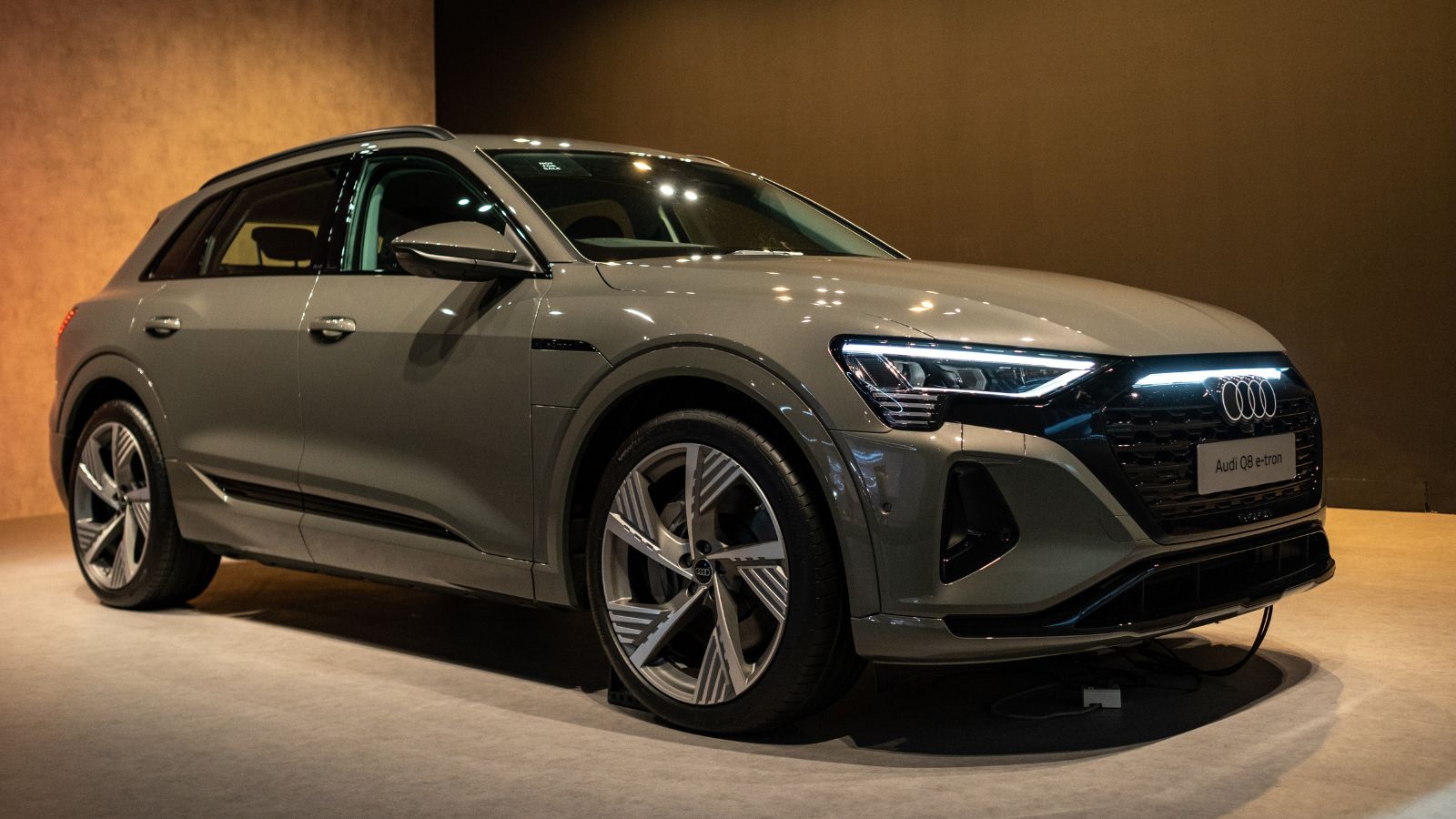
The Audi Q8 e-tron uses dual touchscreens for most controls. The lower screen handles climate functions. Drivers must press firmly to activate inputs. This haptic feedback helps, but still needs attention. Menu navigation adds extra steps for simple tasks. The layout looks sleek but feels complex at times. Sunlight can reduce visibility on both screens. New users often take time to adjust. Even then, quick changes are not always easy. The design focuses on appearance, but usability can suffer during daily driving situations on busy roads.
Nissan Ariya
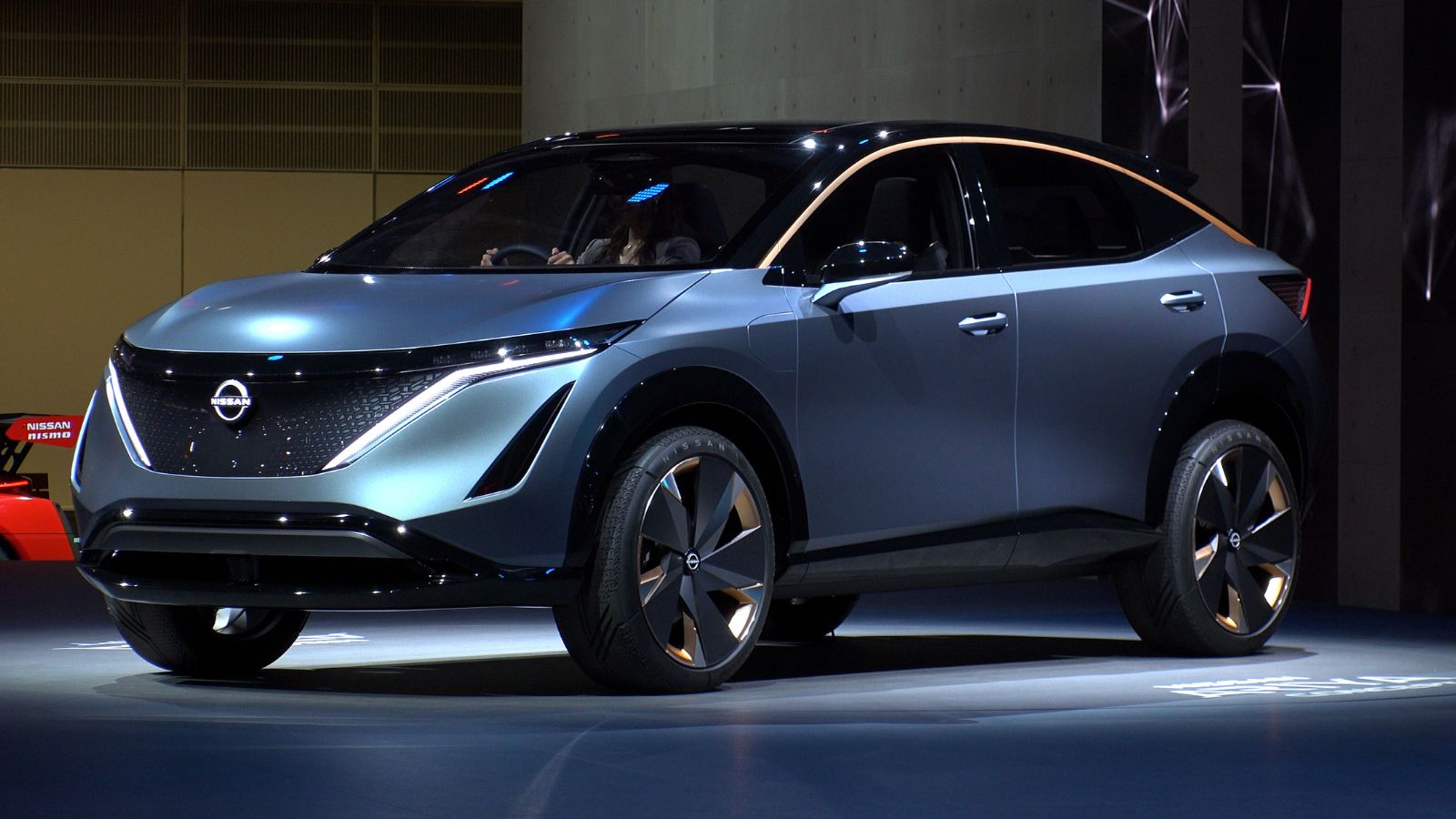
The Nissan Ariya integrates touch controls into wood-like surfaces. These buttons blend into the design and look stylish. However, they lack clear tactile feedback. Drivers must look down to use them properly. Climate and media functions rely heavily on the screen. Menu navigation requires extra attention while driving. The interface works smoothly but feels less direct. Fingerprints can affect visibility over time. The design prioritizes aesthetics over practicality. Every day use reveals small frustrations. Simple adjustments take longer, which can distract drivers during routine driving situations on busy roads.
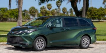
Subaru Outback
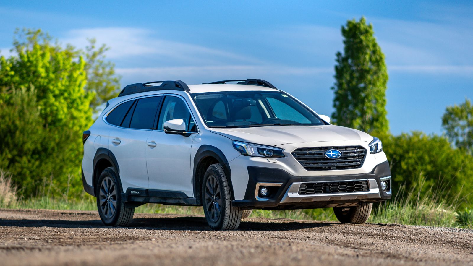
The Subaru Outback uses a large vertical touchscreen for many controls. Climate settings sit inside the display instead of buttons. Adjusting the temperature takes several steps. The system can lag during startup, which delays input. Drivers must wait before making changes. Screen glare can affect readability in bright conditions. The interface looks simple, but feels slower in use. Physical shortcuts are limited in this setup. Daily driving highlights the inconvenience. Basic tasks should feel quick and direct, but here they require more effort than expected from most drivers.
22 Things Canadians Do to Their Cars in Spring That Mechanics Hate

Spring brings relief to many Canadian drivers after months of snow, freezing temperatures, and icy roads that put serious strain on vehicles. As temperatures rise across the country, drivers begin washing cars, switching tires, and preparing vehicles for warmer weather and upcoming road trips. However, mechanics across Canada notice the same mistakes every spring when drivers attempt to recover from winter damage. Road salt, potholes, and harsh winter driving conditions often leave vehicles with hidden problems that drivers ignore. Some spring habits even create new mechanical issues that could have been avoided with proper maintenance. Here are 22 things Canadians do to their cars in spring that mechanics hate.


